Gen AI for Investment Management Research

A Benchmark of the Digital Customer Journey in Insurance when using a Smartphone.
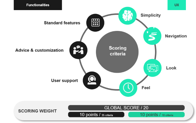
To shed some light on the current state of the digitalization of the Customer Journey in Financial Services in Belgium, Sia Partners conducted a benchmark of 12 major insurance players. The benchmark relies on the scoring of 45 criteria and provides more clarity on the tops and flops on the market, in terms of both functionalities offered and user experience.
This benchmark was conducted in the fourth quarter of 2020 (end of October to mid-November) for 12 Insurance players in Belgium, assessing 45 criteria regarding the Digital Customer Journey. Specifically, the challenges clients are facing while searching for and subscribing to a Family, Home or Car Insurance product. This analysis was carried out using only smartphones via the most digital medium offered by each insurer. In practice, while some insurers offer apps covering all the steps of the customer journey that we tested, others only offer mobile-responsive webpages.
The four steps of the customer journey considered in this benchmark are: Discovery, Simulation, Quotation and Subscription.

Two categories of criteria were considered:
To ensure comparability and a transparent scoring, criteria are scored from “0 – Null: The evaluated item is not provided” to “3 – Excellent: The evaluated item is included and fully effective”.
The digital medium available for each step of the Customer Journey (whether app or mobile-responsive webpages) has no impact on the scoring: the general hypothesis being that well-designed mobile-responsive webpages can be as good as apps.
The final score ( / 20) was computed by weighing each criterion based on its importance with 10 points attributed to Functionality and 10 points to UX.

While most insurance companies offer at least one app related to home, family or car insurance (all but Baloise, Fédérale and Corona Direct); the scope of those is, in most cases, limited to a very specific part of the Customer Journey:
Only bank-insurance players (BNP, CBC/KBC, Belfius and ING) have included some insurance features that allow customers to complete most steps of the Customer Journey online.
We thus benchmarked the mobile apps for those 4 players while we tested the mobile web versions of the rest of the competitors (Axa, AG Insurance, Ethias, Baloise, P&V, Allianz, Fédérale, Yuzzu and Corona Direct).
In terms of digitalization of the Customer Journey, while some insurers allow customers to subscribe almost entirely online, some require customers to perform numerous steps offline. The first offline step for each insurer is as follows:
Insurers collaborating with brokers (Axa, AG Insurance, Baloise, P&V, Allianz and Fédérale) usually redirect prospective customers to brokers after giving a quote following a simulation. The only exception is Axa who allow customers to subscribe online.
Direct insurers (Ethias, Yuzzu and Corona Direct) and bank-insurance players generally have a better digital Customer Journey, which falls short when the customer must either print the contract (which can be inconvenient when subscribing via a smartphone), receive a phone call, or send documents by post.
The possibility for prospective Belfius and CBC/KBC clients to subscribe digitally and to be able to easily upload documents via their apps makes their Customer Journey particularly convenient.
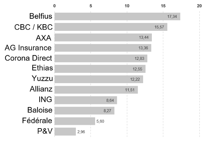
Belfius and CBC/KBC rank first and second in our benchmark as they offer a (almost for CBC/KBC) fully integrated Digital Customer Journey with numerous functionalities available, and a flawless UX.
Axa is ranked 3rd as subscription can be done online and the user interface is well-rated, although no app is available.
BNP / AG Insurance is placed 4th. While BNP clients can go through most of the Customer Journey online by using the Easy Banking App (a video or phone call is required to finalize the subscription), AG Insurance clients and prospective clients are required to finalize their subscription via a broker.
The 3 direct insurers (Corona Direct, Ethias, and Yuzzu) are quite close thereafter. While Ethias' functionalities rank above average, some points are lost due to their UX. On the contrary, Yuzzu and Corona Direct have a decent UX but impose an important break in the Customer Journey by requiring the customer to print (in practice) the insurance offer.
Although Allianz redirects prospective customers to a broker to subscribe, it still manages to get a fairly high score thanks to their performance in terms of functionalities and UX for the Discovery and Simulation steps.
ING is the bank-insurance player counterexample. While existing ING clients can perform nearly all the steps of the Customer Journey via their app, prospective clients, after having received a quote, are stuck at a webpage asking them to log in as an ING client (something that is impossible as a prospective client).
Finally, 3 broker-oriented players (Baloise, Fédérale and P&V) close the ranking due to their lower-than-average UX and functionalities. P&V finishes last as it is not even possible to perform a simulation online.

A few more conclusions can be drawn from the general scores:
In the coming years, mobile and digital interactions between insurance providers and (prospective) customers, as a share of the total number of interactions, will continue to sharply increase. Nevertheless, digitalizing the customer journey is not yet the norm for most insurance companies.
All in all, the global scores of our benchmark are very dispersed. The gap between the best and worst is significant. Although part of it might be due to voluntary business model orientation (broker and offline service-oriented insurer vs digital insurer), Sia Partners believes that having a well-designed, fully integrated digital Customer Journey is a serious competitive advantage. Moreover, for many players, meaningful improvements could be reached thanks to relatively easy quick wins.
Anthony Wolf
Partner
+ 32 477 33 77 37
anthony.wolf@sia-partners.com
Sébastien Carvelli
Senior Consultant
+ 32 486 79 09 40
sebastien.carvelli@sia-partners.com